Anatomy of an Analytics report
In this topic:
Analytics reporting features
The following image gives you a high-level view of all the ways you can manipulate data in most Localytics Analytics reports.
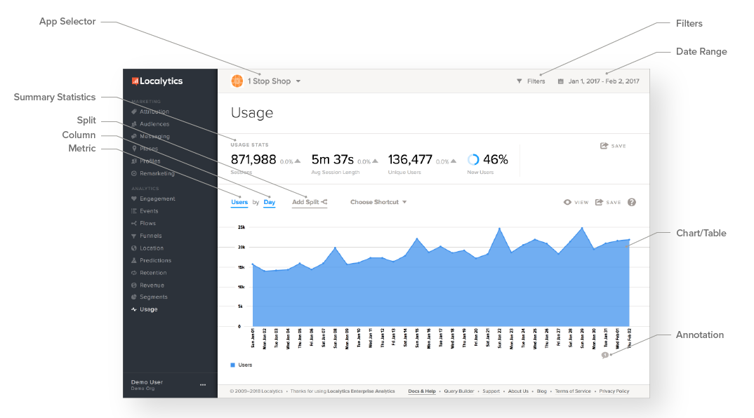
The following table provides a quick overview of each reporting feature. Some features are further explained later.
| Feature |
Description |
|---|---|
| App Selector |
Reports in Localytics are app-specific. Use the app selector in the upper-left corner to navigate between different apps. |
| Filters |
Use a filter to limit reports to show only a subset of data. You can filter reports using dimensions or segments. When viewing an event-powered report, you can also filter using event attributes. |
| Date Range |
Use the date range selector to specify the period of time you want to see in your report. Keep in mind that although Localytics saves the last three years worth of data, you can only visualize up to 396 days at one time. |
| Summary Statistics |
Most reports include summary statistics above or below the chart that give you a quick overview of the data. Some reports also include percentages that show the period-over-period change in the summary statistics. |
| Split |
Splitting allows you to compare subsets of the data in a report. For example, you could split a report by country to see if users from different countries behave differently in your app. |
| Column |
Use the Column drop-down to select how the data is grouped in the report. Your column selection determines the unit shown on the X-axis of the chart (if you are viewing the report as a table, this unit would be in the first column). |
| Metric | Use the Metric drop-down to specify the unit (or metric) shown on the Y-axis of the chart (if you are viewing the report as a table, this unit would be in the cells of the table). |
| Chart/Table |
Most reports can present data as either a chart or as a table.
|
| Save/Export |
Most reports can be exported in CSV or PDF format. You can also add reports to custom dashboards or configure Localytics to email a specific report to you on a daily, weekly, or monthly basis.
Keep in mind that reports with summary statistics have two Save buttons, one for the full report and another for the summary statistics. |
| Report Annotations |
If you are viewing a report with a date on the X-axis, you can add annotations to the report:
|
Tip: If, for some reason, you don't see one of these features in your Analytics report, your account may be missing features or your permissions don't allow you to access certain features. Contact our Support team, and we can clarify things for you.
Filtering data
You can filter the data in your reports by dimensions.
-
Select Filters at the top of the report you want to filter.
-
Select the dimension from the drop-down menus, starting with the Where field.

For example, if you want to filter your data to view weekends only, select the following:
- In the Where field, select Day of the Week.
- In the operator field, select is one of.
-
Select Saturday and then select Sunday.
You can add up to five different dimensions for filtering data.
- When you are done, select Apply.
Note: Filtering data is different from splitting data— for more information, see Splitting data.
Date range
Localytics retains data accessible from the dashboard for up to a year—so you can view more data and make better decisions moving forward.
To view your data within a specific date range:
- Select a predefined date range or specify From and To dates.
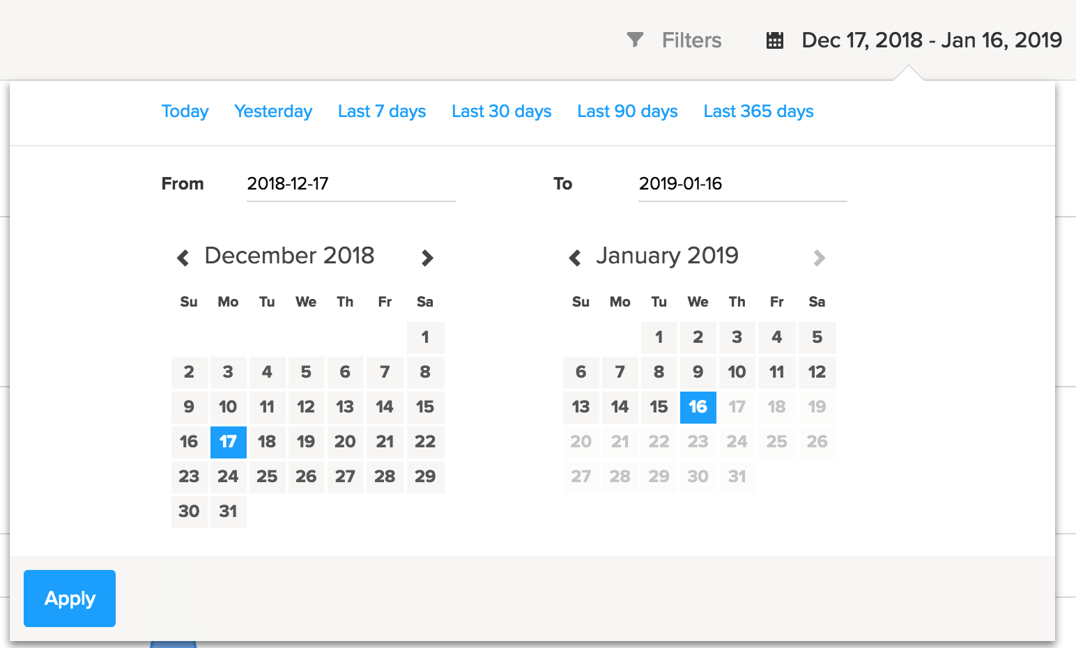
- Select a predefined date range from the options at the top of the form:
- Today
- Yesterday
- Last 7 days
- Last 30 days
- Last 60 days
- Last 90 days
- Last 365 days
- Select From and To dates from the calendars below the date field
- Select a predefined date range from the options at the top of the form:
- When you are done, select Apply.
Splitting data
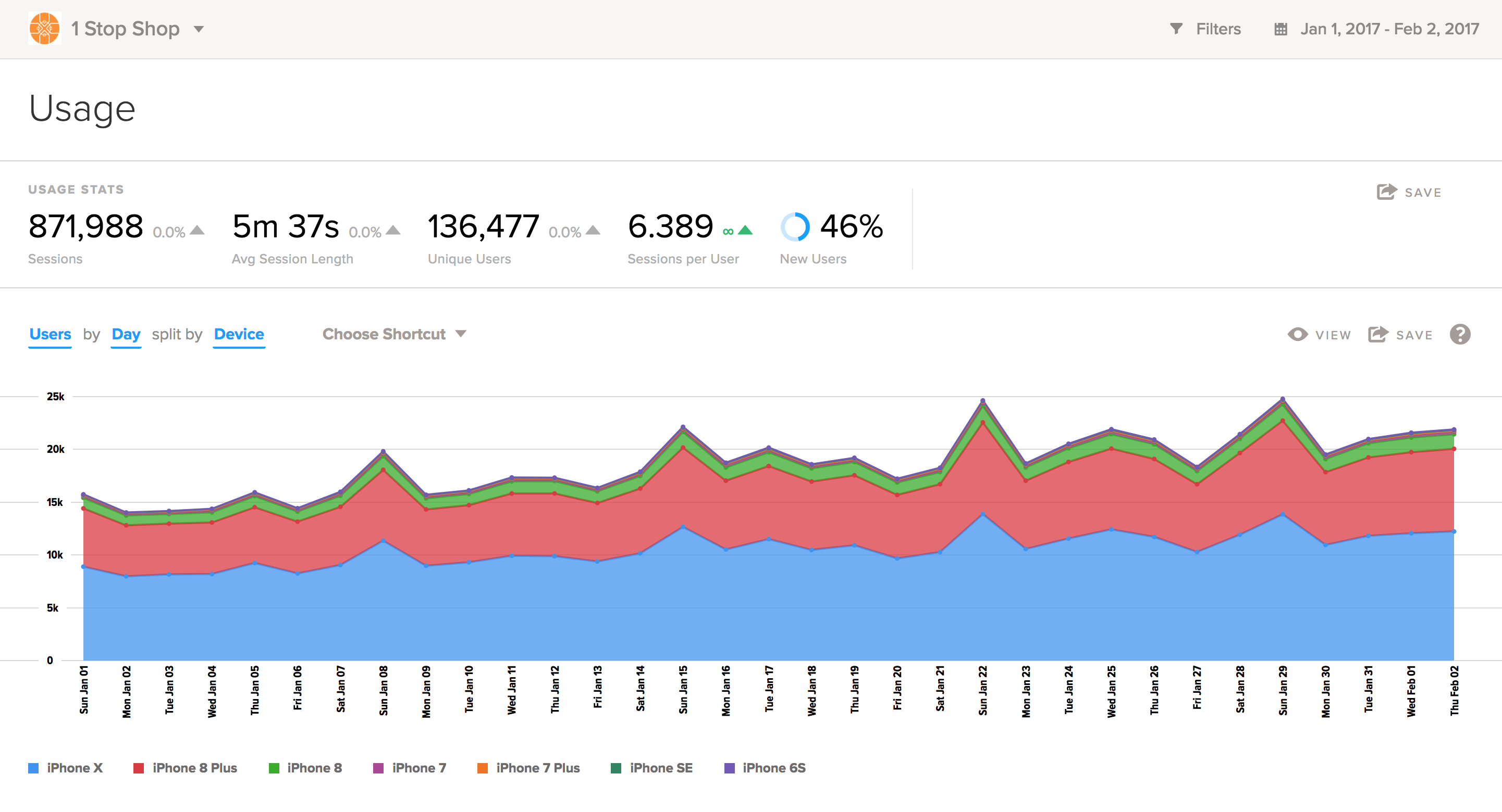
For some charts, the Add Split option is available, so you can split the data by different metrics. This allows you to gain further insight into the user data in the chart.
- Select Add Split.
Note: If you do not see the Add Split option, then it is not available for the current chart.
- Select the metric by which you want to split the data.
For example, if you wanted to see which types of devices your users were using to access your app, you could split the data by device.
Shortcuts
For some reports, the Choose Shortcut option is available, so you can view the user data by different metrics or splits.
-
Select Choose Shortcut.
Note: If you do not see the Choose Shortcut option, then it is not available for the current report.
-
Select the metric or split by which to view user data.
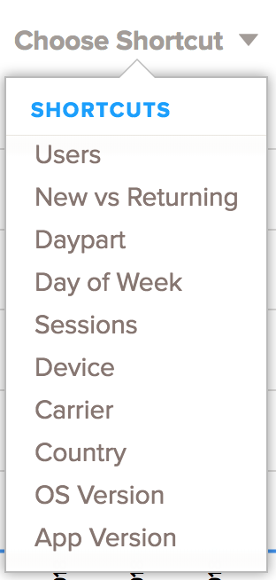
For example, Instead of selecting Users by Country manually, you could select Shortcuts - Country to view user data more quickly.
View
To change the way the data is displayed:
-
Select View.
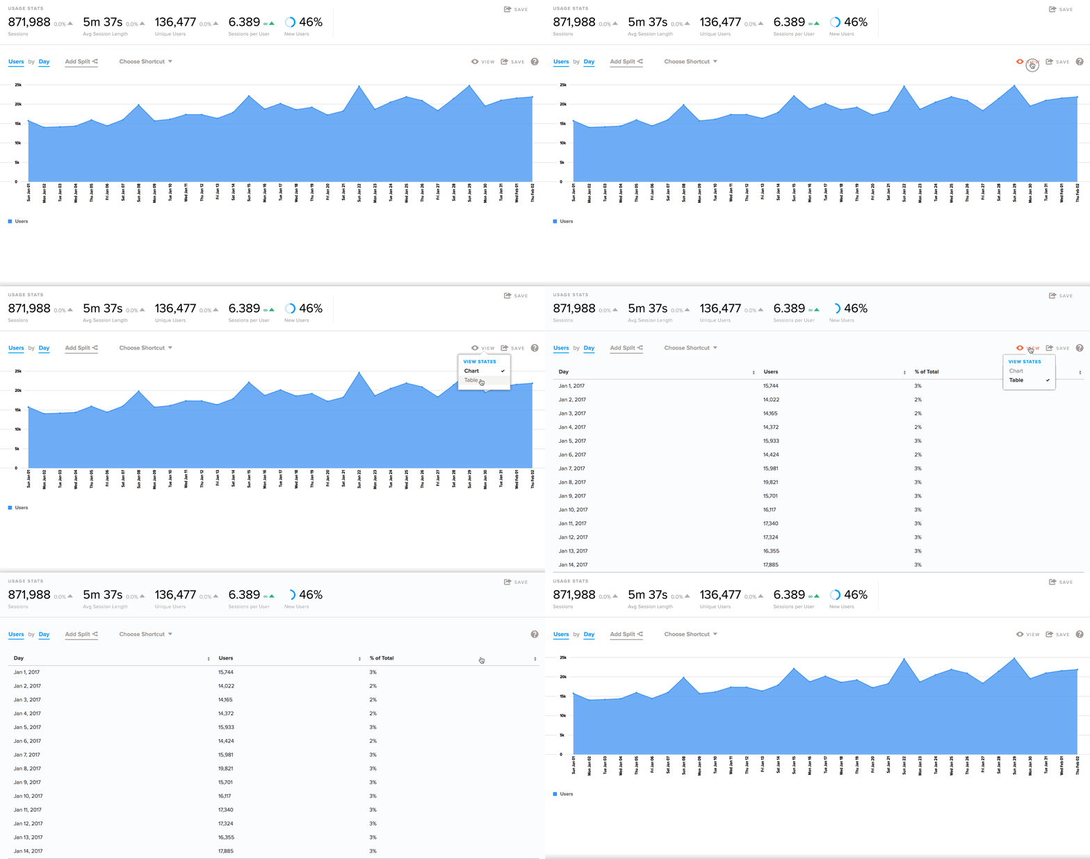
- Select Chart or Table:
Chart is the default view, which displays data in a graph form.
Table displays data in numeric format, like a spreadsheet.
Save
To save your data or export it to a file:
-
In the upper-right corner, select Save.
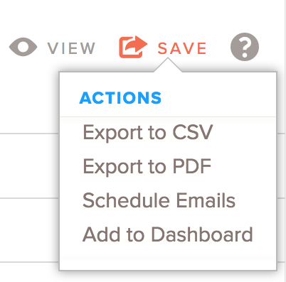
- Select one of the following:
- Export to CSV: saves the data in a numeral, or table, format in a comma-separated values (CSV) file.
- Export to PDF: saves the data in graphical, or chart, format in a PDF file that you can pass along to others who may not have access to the Localytics dashboard.
- Schedule Emails: sends a regularly email containing the user data in a chart.
- Add to Dashboard: adds the report to a custom dashboard:
- To view it immediately, select View in the message bar.
To view it later, select the ellipsis (...) at the bottom of the left pane, next to your name, and then select My Dashboards.
To learn more about building a custom dashboard, see Custom dashboards.